
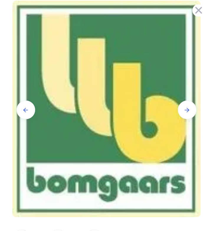
Yeah let’s put the letter b in our logo 3 times, the three bs don’t stand for anything, but they just look cool, right?
![]() campfireheadphase
41 Votes
campfireheadphase
41 Votes
Yeah let’s put the letter b in our logo 3 times, the three bs don’t stand for anything, but they just look cool, right?
Enter your account data and we will send you a link to reset your password.
To use social login you have to agree with the storage and handling of your data by this website. Privacy Policy
AcceptHere you'll find all collections you've created before.
You won’t like my opinion but I think you are seeing things that aren’t really there this time.
All opinions are welcome, what do you think is the reason they used the triple bs? I actually work for this company and no one can give me a straight answer. They don’t stand for anything besides the b in bomgaars. If I could understand the reason maybe that would change things.
Guess it’s just a logo gimmick, there’s only one ‘b’ and the rest might be the “look at me, I am not only a b but something more” marketing stuff.
Could it be a satanic message, a triple 6? Yeah, can’t say it’s not possible, but it looks too simple for a such thing (no other symbols, obvious colors or shapes). If these messages are for telling the insiders that ‘we are here’, then this one is way too innocent looking. But maybe that’s the way to disguise it.
We will never know for sure.
For me it seems way too specific to be a marketing/graphic design coincidence, but I can appreciate a different point of view.
For me, no matter how you slice it, it’s a graphic design faux pas. If those three figures were intended to represent the same thing then the space left in the b on the right should match each similar space on the left two figures, but they don’t match. Each space on the first two figures is about 1.7 × the width of the third. OK, now I can see that the difference is that the green border surrounding of each figure is not in the space on the last b but it is in the first two bs. The artist should have made the spaces the same. The graphics director should be reprimanded.
Look Al the wiki on the company. No info on owner and the picture along with the store number should tell it all. Even a incident at a school within that city
You can’t throw a rock in the Midwest without hitting a Masonic temple.
Somehow i dont think Satan cares about the yard supplies and bird feed industry. LMAO
It cares about people d doing his deeds
Satan is Saturn, the god of the harvest. And that thing is also all the other pagan dying and resurrecting gods associated with crops, wine, etc.
And don’t forget agriculture is a cornerstone of a lot of NWO stuff, GMO crops, highly processed food, etc.
I will like to add the “gaa” inis an upsidedown six six six too, the a is a six cut off.
so obvious, what a weird name too
Love the username but Music Has the Right to Children is the better album ? ?
Love them both but campfire is super nostalgic for me 🙂